
When Blue Reef came to us, they wanted more than a visual update. They needed a brand that could help articulate what they uniquely offer in an unpredictable marketplace.
We began with market and customer research, mapping perception gaps and defining opportunities for distinction. Those insights became the foundation of a clear positioning strategy that guided every creative decision that followed.
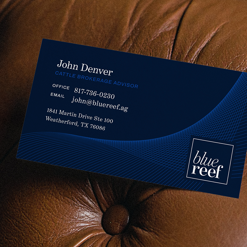

The new identity is anchored by a sophisticated serif wordmark that feels both confident and approachable. The color system—rooted in deep navy and calm blue tones—reflects their steady presence in a turbulent industry. A fine-line wave pattern was introduced to symbolize movement and market fluctuation, reinforcing the balance between precision and adaptability.
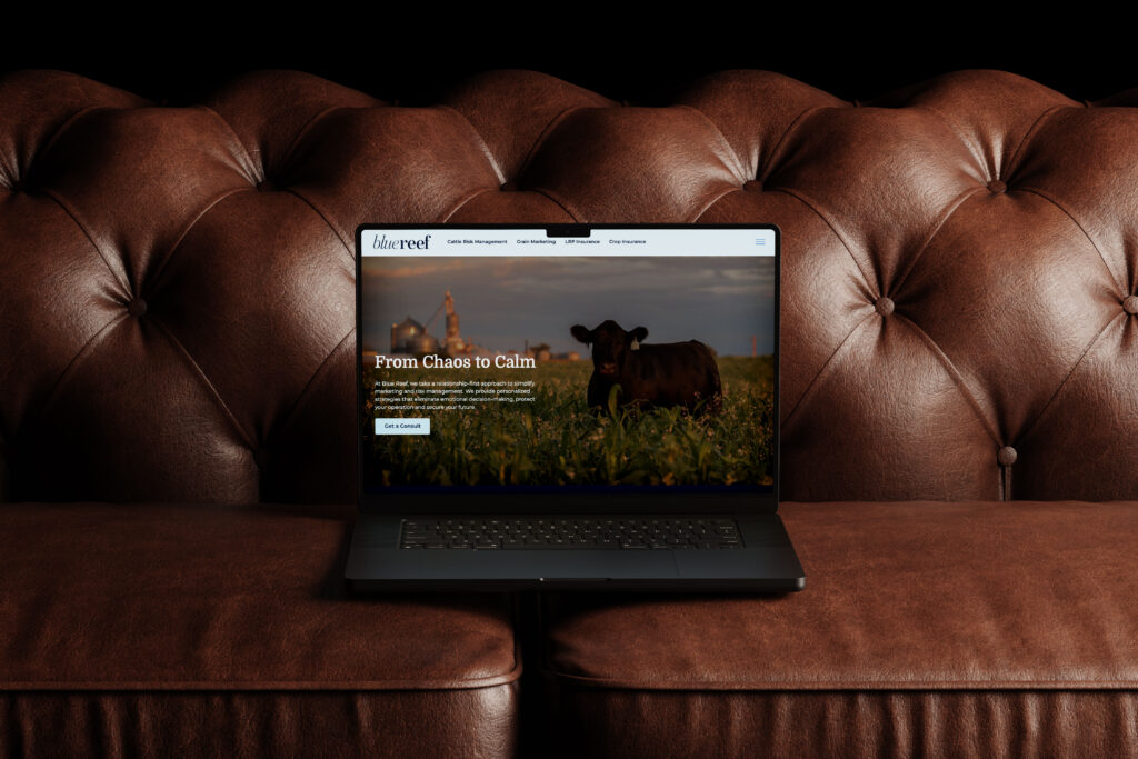
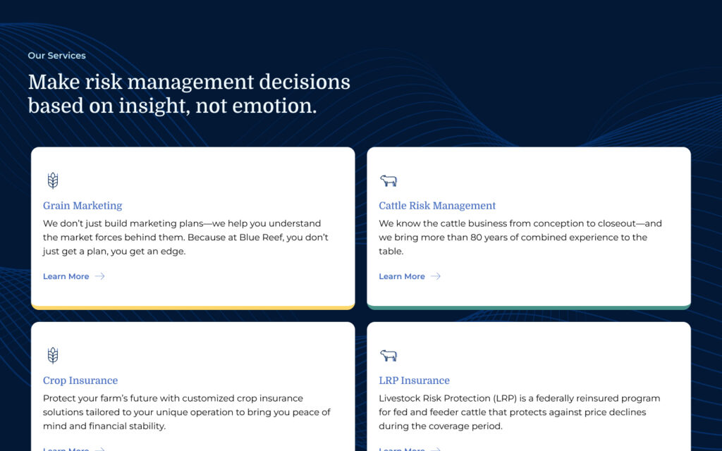

The Blue Reef website brings this identity to life through a user experience that simplifies complexity. Content was restructured around education and reassurance, helping clients find exactly what they need to make informed decisions. The visual and verbal tone align seamlessly, emphasizing calm, clarity, and control.
From digital to print, every piece of the new brand reinforces the same message: Blue Reef helps clients navigate uncertainty with confidence and composure.