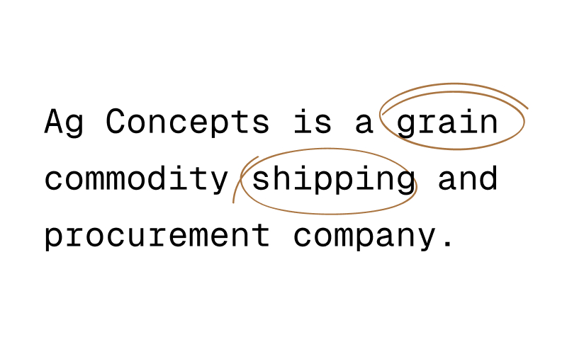
Ag Concepts came to us ready to elevate their look from small-town grain buyers to a scalable, professional logistics partner. They were clear on what they did—grain shipping and procurement—but their old identity didn’t say “modern operator.”
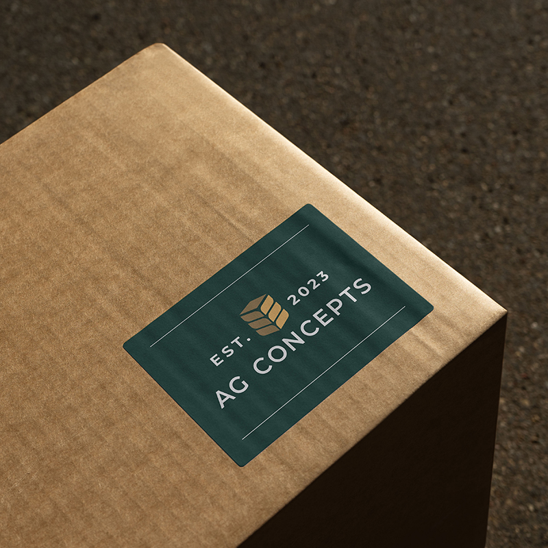
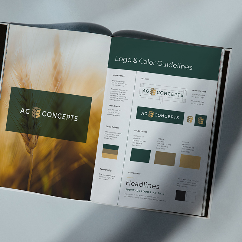
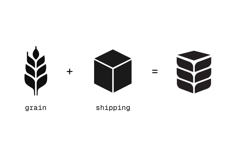
We began by unpacking their dual role: agriculture and logistics. The creative concept merged a grain head and a shipping box—representing both the product and the process that defines their business. The final mark layered these two elements into one clean, geometric symbol that instantly tells their story.
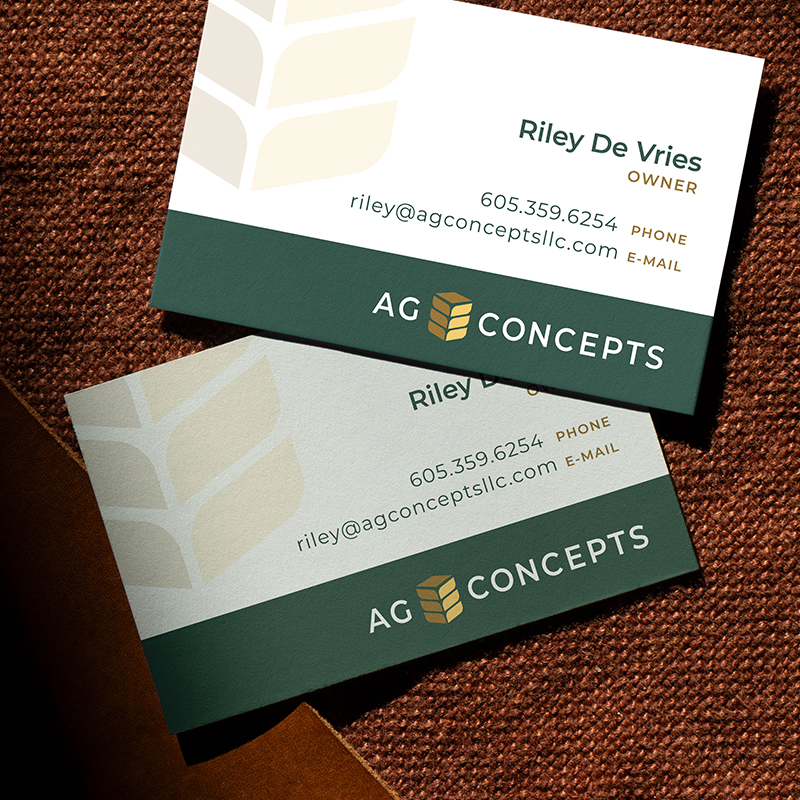
The logo system was paired with a warm, grounded color palette—deep green, wheat gold, and slate—to evoke reliability and craftsmanship. Typography was set in a modern sans serif for clean legibility across signage, packaging, and digital use.
We extended the visual identity across key applications—business cards, packaging labels, and a signature trucker hat—bringing a professional edge to every customer touchpoint. The result: a confident, contemporary identity that feels at home in both the field and the boardroom.